
- Role
- Senior Product Designer
- Scope
- UX/UI Wireframing Prototyping Design systems
- Team
- Product and Engineering teams
- Timeline
- Nov 2021 – Jun 2022
- Platform
- iOS, Android, web
Case study · Consumer mobile & web · 2021–22
Delivery Hero
Product design across the Delivery Hero group, from the pre-orders experience in consumer apps to internal vendor and catalog tools, inside a shared multi-brand design system.
Internal tools. Some screens show a staging environment.
Problem
Designing across many brands and markets with a unified experience, under different market constraints and legal requirements.
What I did
I designed parts of the consumer apps and built vendor and catalog management tools.
Result
Improved the customer experience of consumer apps and internal tools for several teams.
Context & problem
Delivery Hero, headquartered in Berlin, connects restaurants and customers across 70+ countries, under many local brands. Designing across that many brands and markets meant balancing each one’s own identity against the need for a consistent experience: different guidelines, market constraints and legal requirements, all pulling in their own direction.
- Countries
- 70+
- Brands in the group
- 10+
- Restaurant partners
- 500,000+
Scope & my role
I worked across the group, mainly improving key parts of the Foodpanda app and building customer and vendor management tools for Yemeksepeti and Foodora, among others, alongside Product and Engineering and within a shared multi-brand design system.
I owned
- Pre-orders experience for the consumer apps
- Web navbar redesign for order type, time and location
- Internal management tools
Worked with
- Product and Engineering teams
- The shared multi-brand design system
- Stakeholders from several brands
Consumer Apps
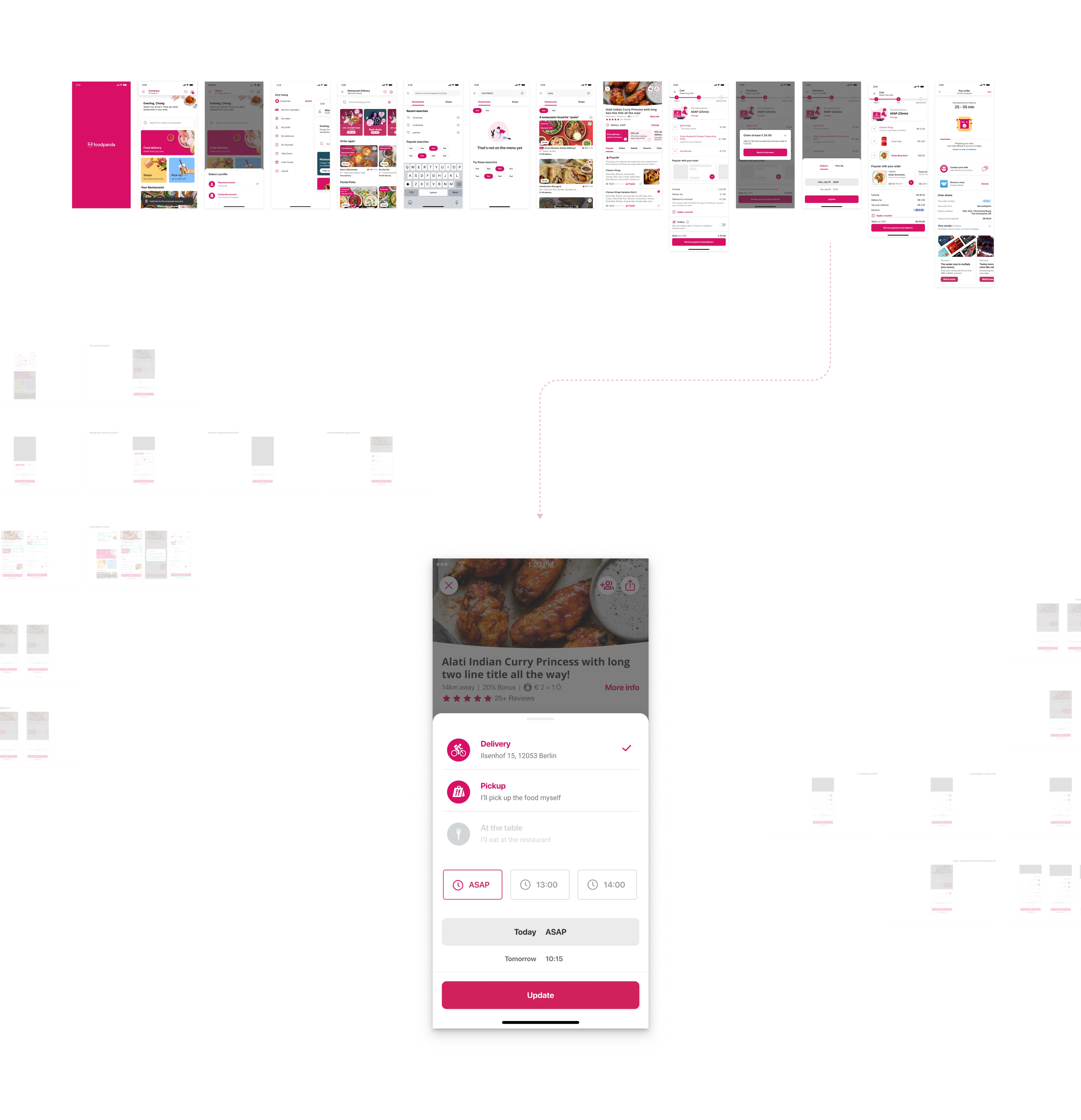
On mobile I worked across several parts of the consumer app, but the part I spent the most time on, and found the most interesting, was pre-orders and delivery time slots. The ordering flow, choosing delivery or pickup and a time, is shown at the top of this page.
It turned out to be more of a logistics problem than a UI one. If a customer doesn’t need the order right away, a rider can hold off and plan a smarter route: grouping it with other deliveries on the same trip instead of making a special one. That cuts transport costs. Suggesting common slots around typical lunch and dinner times pushed customers toward scheduling ahead, without making pre-ordering feel like a downgrade from ASAP.
Although only one brand is shown here, the pre-orders concept itself had to be modular: it was later ported to other brands, and it had to work depending on the brand and the country, since not every market supported pre-orders in the same way.
Consumer Website
I also helped on the web side of the Foodpanda app. The old navbar had no delivery/pickup or time selection at all, just an address. Type lived as a toggle further down the page, and the time question wasn’t asked until checkout. By then the business had already lost any early signal to act on: no chance to adjust promotions, flag limited availability, or otherwise tailor the experience to a scheduled order versus an ASAP one.
I redesigned the navbar so all three decisions sit upfront: what (delivery or pickup), when (ASAP or a scheduled time) and where (the delivery address). It’s a persistent control at the top of the page, visible before a customer even opens a restaurant.
Internal tools
The internal tools are harder to put a number on than the consumer-facing work, but they’re what vendors and account managers used to run their day-to-day. These are screens from the Foodora vendor back office, already built on Google’s Material Design system. Adapting to that felt constrained and a little old-school compared to a bespoke design system, but it kept the design-to-dev pipeline fast.