
- Role
- Senior Product Designer
- Scope
- Mobile app design Design language Component library Internal tools
- Team
- In-house mobile apps team, supporting three developer teams
- Tools
- Sketch
- Timeline
- Jun 2016 – Sep 2017
- Platform
- iOS, Android, Windows Mobile
Case study · E-commerce mobile apps · 2016–17
Zalando
The redesign of the legacy Zalando apps for 20M+ active customers, with one design language across iOS, Android and Windows Mobile.
Problem
The apps had outdated, platform-specific designs, and the design language was not consistent across iOS, Android and Windows Mobile.
What I did
I redefined the look and feel, unified the design language across platforms and built a Sketch library of components and templates.
Result
A cleaner, hybrid approach aligned with the web, and a better overall experience, reflected in rising metrics after extensive user testing and gradual rollouts.
Context & problem
Zalando is an online fashion retailer headquartered in Berlin, live in 15 markets across Europe. I joined the mobile apps team in the summer of 2016 to overhaul the apps for iOS, Android and Windows Mobile.
The apps came from outdated, platform-specific designs. The aim was to modernise their look and feel and make them consistent across platforms, moving to a cleaner, hybrid approach that matched the advances on the web side.
Scope & my role
I was part of the in-house mobile apps team, leading the redesign of the apps for 20M+ active customers. Three designers supported three native platforms and more than 20 developers across those teams.
I owned
- The look and feel of the mobile apps on three platforms
- A comprehensive library of components and templates in Sketch
- Internal tools and workflows: onboarding, internal communications and design-to-dev handoff
Worked with
- Three developer teams
- Users, through extensive testing and gradual rollouts
One design language
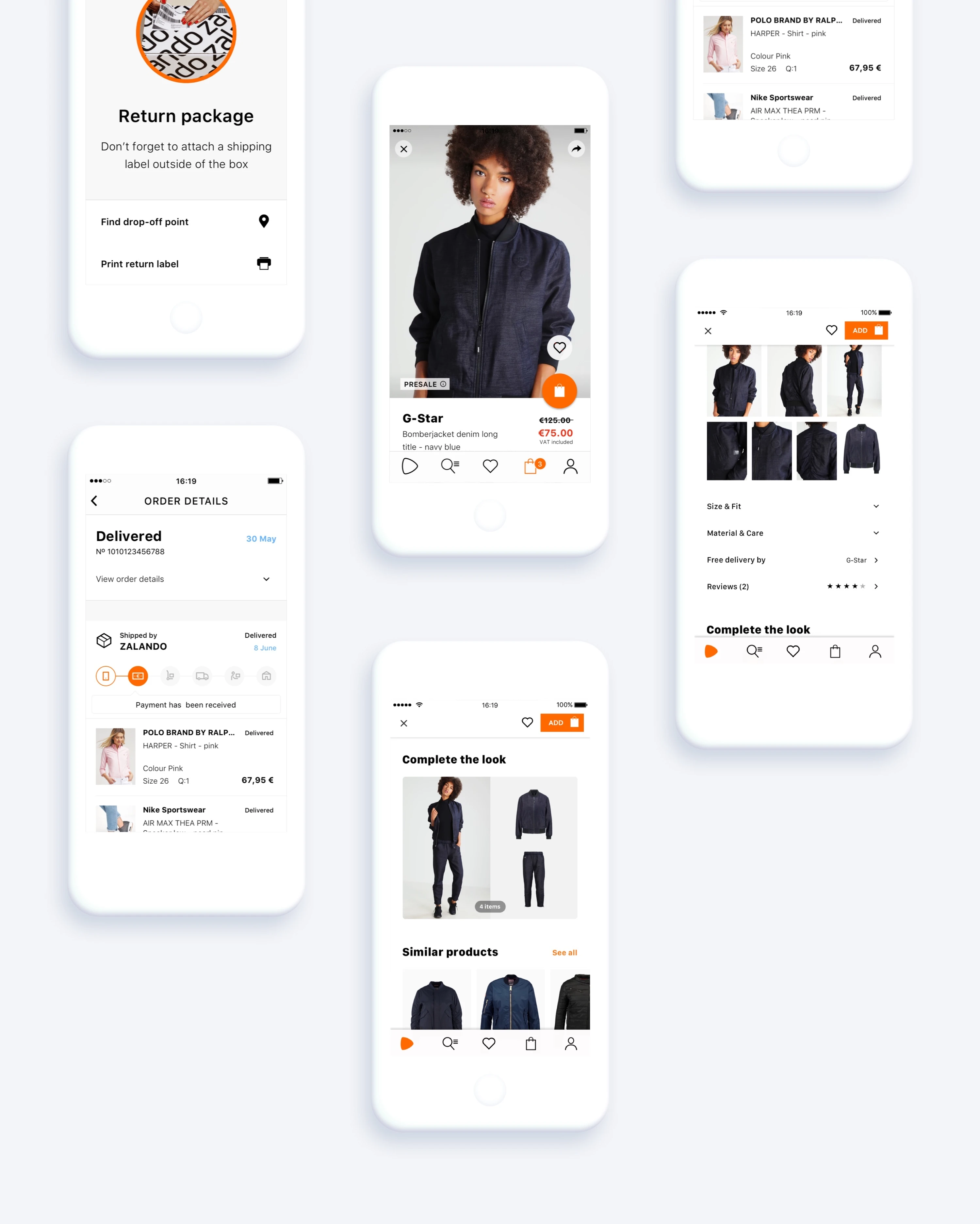
Getting a unified design language across three platforms without flattening what made each one feel native took a lot of back and forth. We kept the elements each platform’s guidelines expected and built a shared layer of common, unique elements around them. The redesigned apps are shown at the top of this page.
A component library
I used Sketch to build a comprehensive library of components and templates, which made both design and development more efficient.
Testing and rollout
The redesign improved the overall user experience, reflected in rising metrics, thanks to extensive user testing and gradual rollouts. Supporting three developer teams at once meant constant back-and-forth on what “consistent” should mean per platform.
- Active customers
- 20M+
- Native platforms
- 3
- Developers
- 20+
The design toolkit
While formalising the updated design language, I also designed and developed the first concept of the Zalando Design Toolkit, to speed up the work of designers across many teams in the company. Its start page groups the toolkit into five parts: onboarding, Sketch templates, a Mac app, a list of resources and a UI library, alongside a playbook site with a guide to visual design methodology at Zalando.
The video shows the menubar design toolkit itself: centralising resources, a knowledge base and quick access to the rest of the toolkit. The toolkit was adopted by the whole design team and continued to be used after this first version.